Campus Trace: visualizing mobility friction across 35,000 students
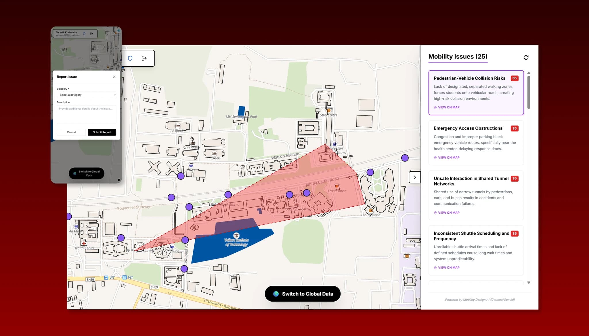
When a broken streetlight or blocked pathway goes unreported, campus friction compounds daily.
Students complain locally, but campus administration lacks visibility into aggregate spatial patterns to resolve systemic infrastructural problems. CampusTrace was built to bridge this disconnect by enabling students to drop pinpoint issue markers instantly, while using Gemini AI to synthesize hundreds of disparate complaints into prioritized administrative hotspots.
A high-density collaborative map built for real-world university scale.
Engineered as a solo build, CampusTrace combined client-side spatial geometry with scalable serverless data persistence to deliver instant 60fps pan/zoom interaction across campus boundary maps.
Students didn't lack concern; traditional form-based reporting felt like shouting into a void.
To get students to engage actively, the reporting mechanism needed to be as effortless as dropping a pin on a spatial map.
For administration, the challenge was the inverse: sorting through hundreds of fragmented reports of "broken light" created decision paralysis. They needed an analytical layer capable of identifying systemic root failures rather than individual symptoms.
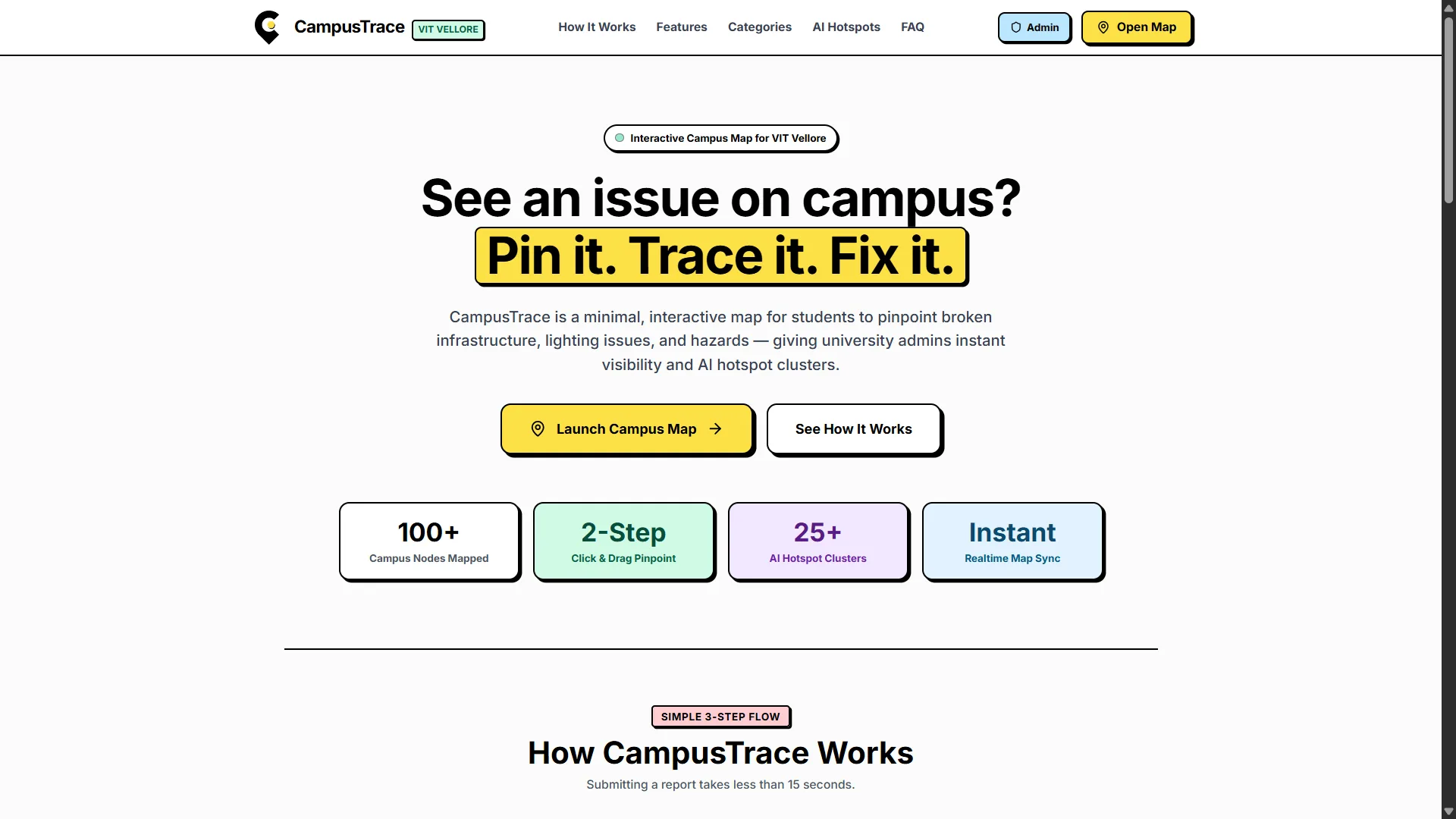
Neo-Brutalist Visual Languageapproachable, high-contrast clarity for rapid student reporting
Chose a minimal, high-contrast visual style (thick borders, offset drop shadows, vibrant accents) over a sterile corporate dashboard.
Rationale: Approachable aesthetics reduced psychological friction for students, drastically improving submission completion rates during rush hours.
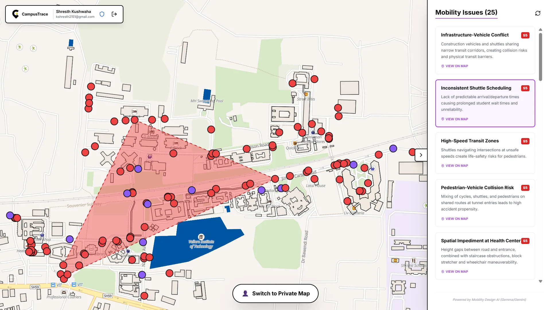
Client-Side Clustering with MapLibrezero server bottlenecks during high-concurrency peak hours
Handled geospatial rendering and spatial point clustering directly on the client thread using WebGL and MapLibre GL.
Rationale: Provided a responsive, 60fps pan/zoom experience without burdening Supabase with thousands of spatial queries during campus rush hours.
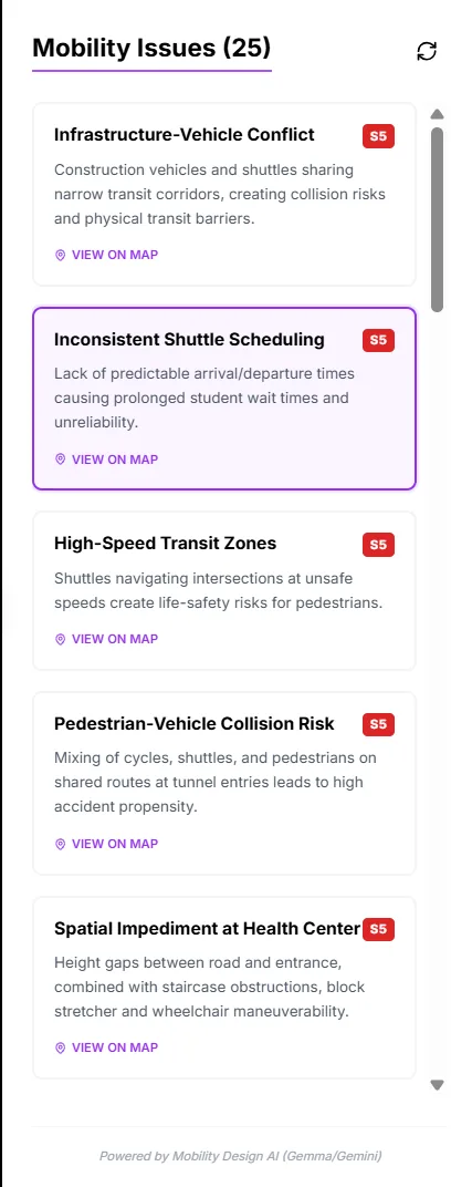
LLM-Driven Semantic Synthesisgrouping issues by thematic friction rather than dumb radius proximity
Utilized Google Gemini Flash to evaluate report text semantics and synthesize them into cohesive operational hotspots.
Rationale: Standard radius clustering fails to differentiate between an electrical hazard and pedestrian congestion in the same 50m zone. Semantic grouping extracted the actual structural cause.
Iterative engineering failures that reshaped the production pipeline.
Building a responsive real-time spatial app required overcoming significant browser memory bottlenecks, prompt scoping errors, and marketing misalignment.
SaaS Marketing Tropes Failed
Early iterations used generic SaaS gradients that clashed with the tactile neo-brutalist web app. Scrapped the marketing boilerplate and aligned all views to the high-contrast physical design system.
Over-Constrained Prompting
Initially prompted the LLM strictly as a "Mobility Analyst," causing it to ignore critical infrastructural and safety hazards. Pivoted the system prompt to a comprehensive "Campus Problem Analyst."
Vercel Deployment Thresholds
Heavy spatial libraries like MapLibre exceeded serverless chunk thresholds. Implemented route-level lazy loading with React Suspense and manual vendor chunking in Vite.
During initial deployment, the platform captured 33 individual friction reports across campus. The AI engine synthesized these into 25 prioritized administrative hotspots.
Layering telemetry, heatmaps, and route cards crowded smaller mobile viewports. I would introduce collapsible bottom-sheet drawers and context-aware legend filters to preserve spatial legibility.
Continuous WebSocket streams caused unnecessary UI re-renders during high-traffic surges. Implementing client-side spatial indexing and requestAnimationFrame throttling would optimize mobile frame rates.