Reconciling product roadmaps across 30 user interviews without losing track of hidden dependencies
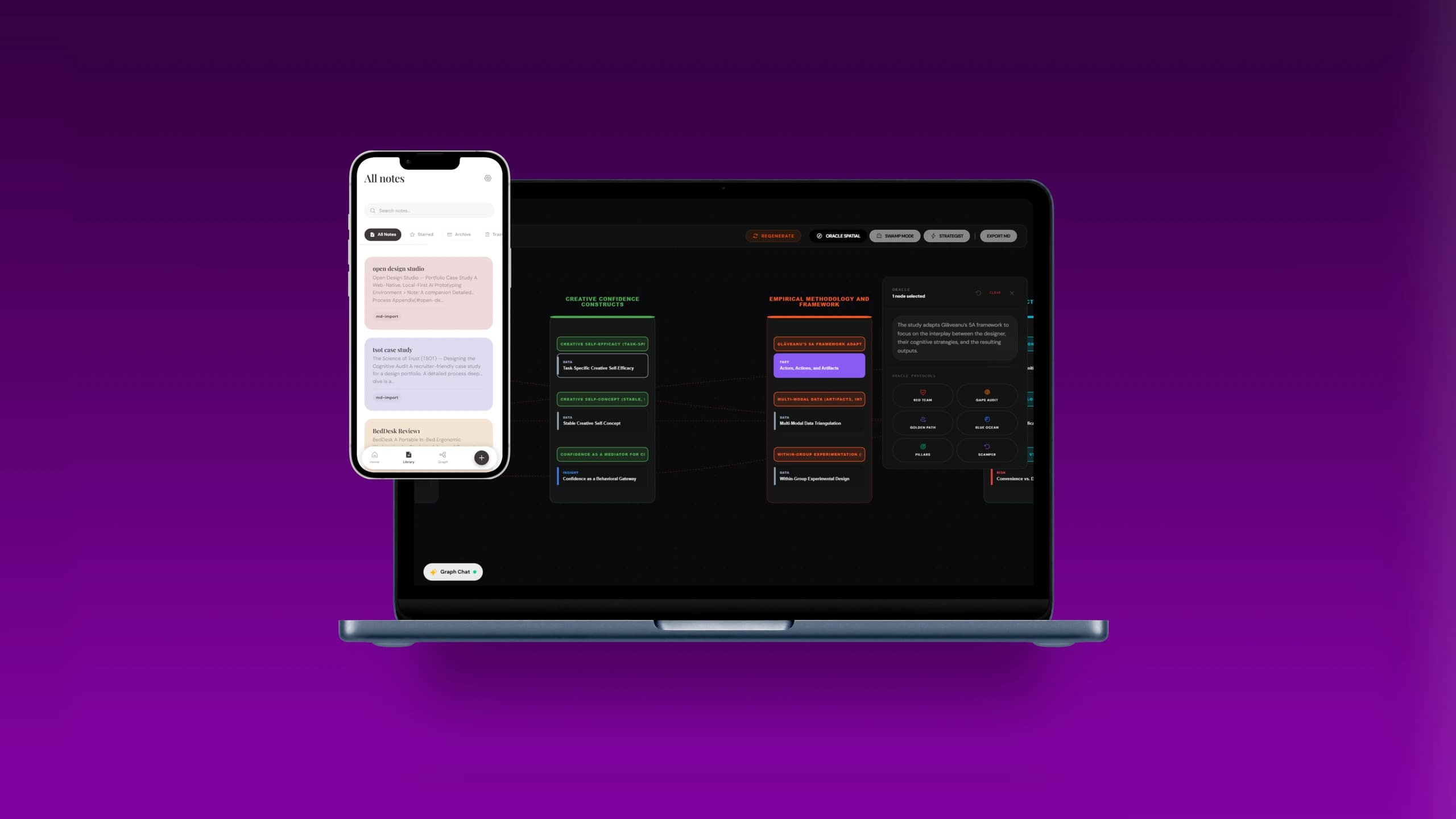
The Evolution of Scribe: 3 MVP iterations before context
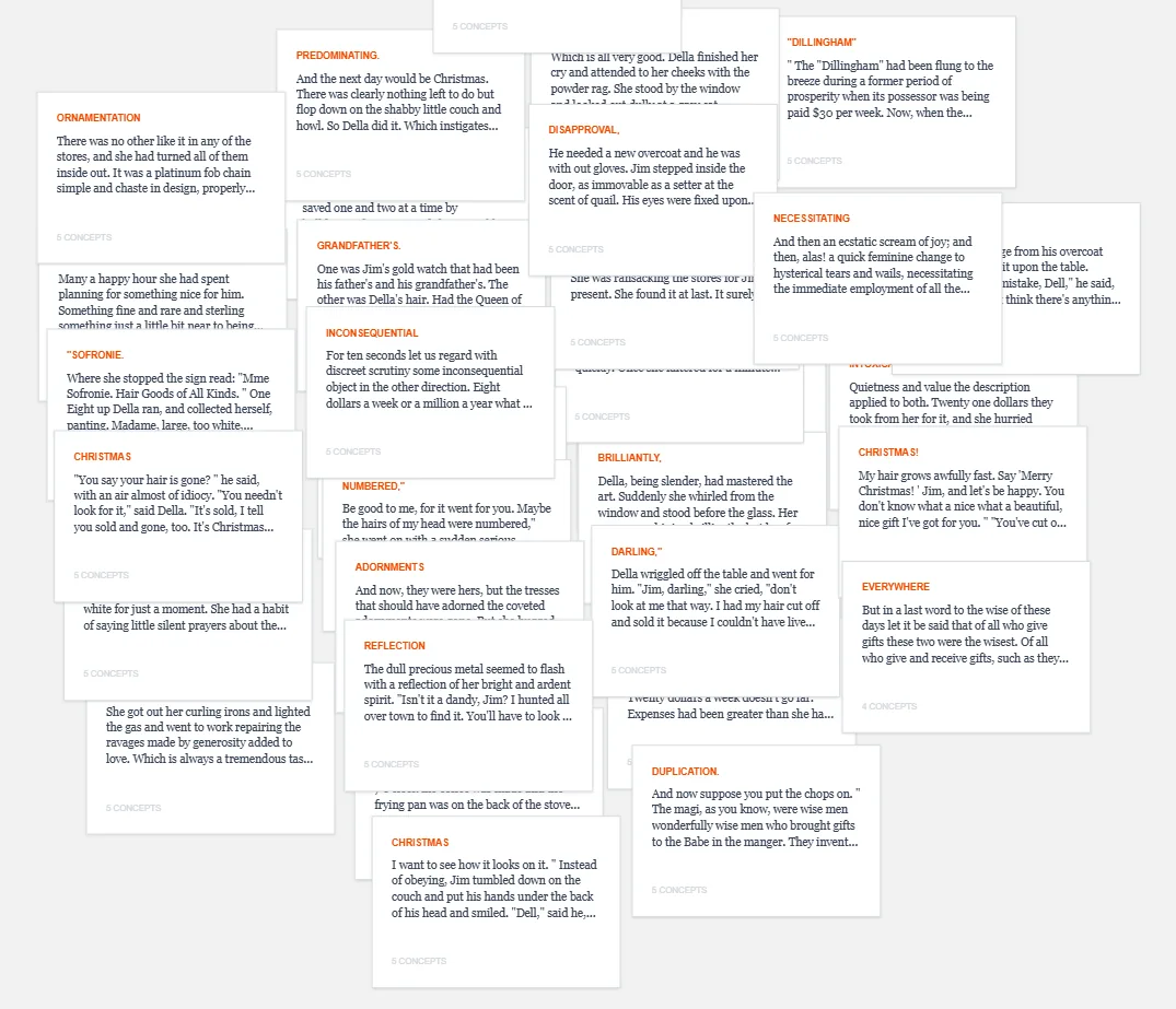
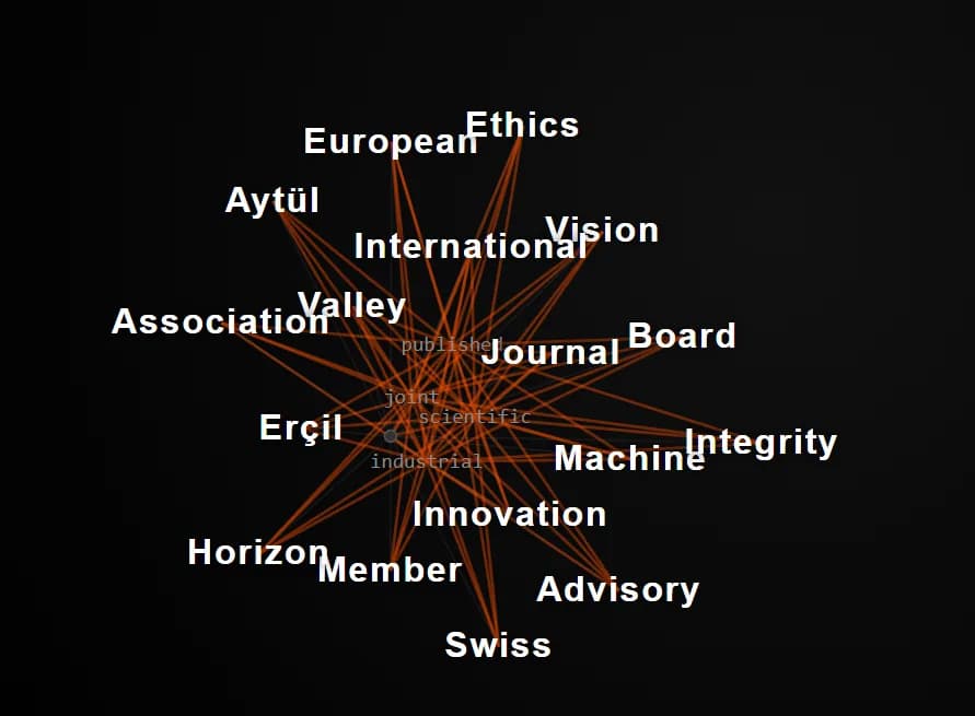
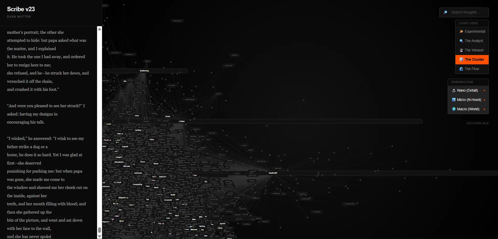
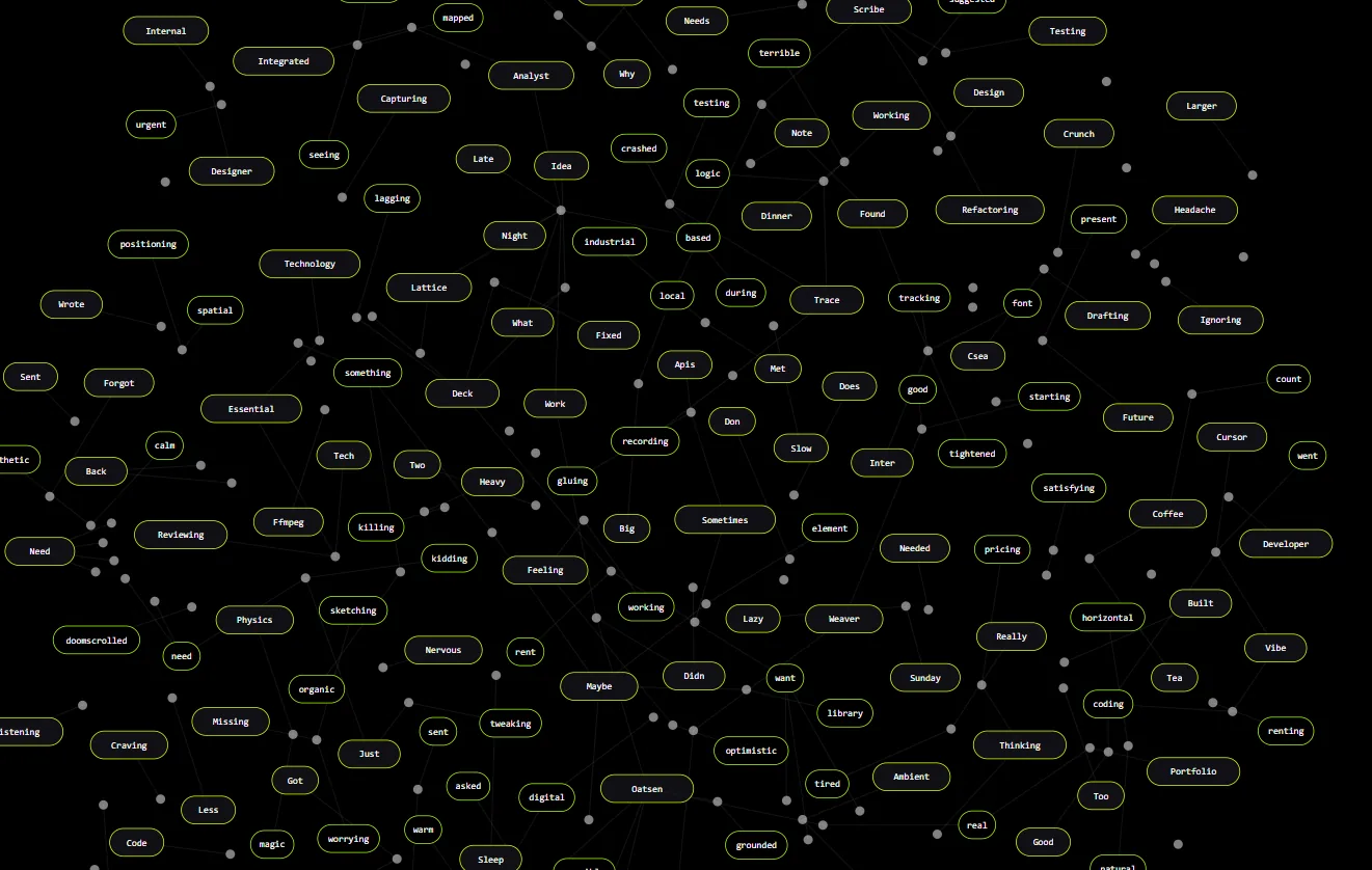
Before landing on rigid hierarchical columns, Scribe underwent three distinct prototypes. Each iteration tested a different mental model—from unconstrained AI connection graphs to qualitative storytelling, before narrowing into rigid strategic hierarchy for decision-makers.
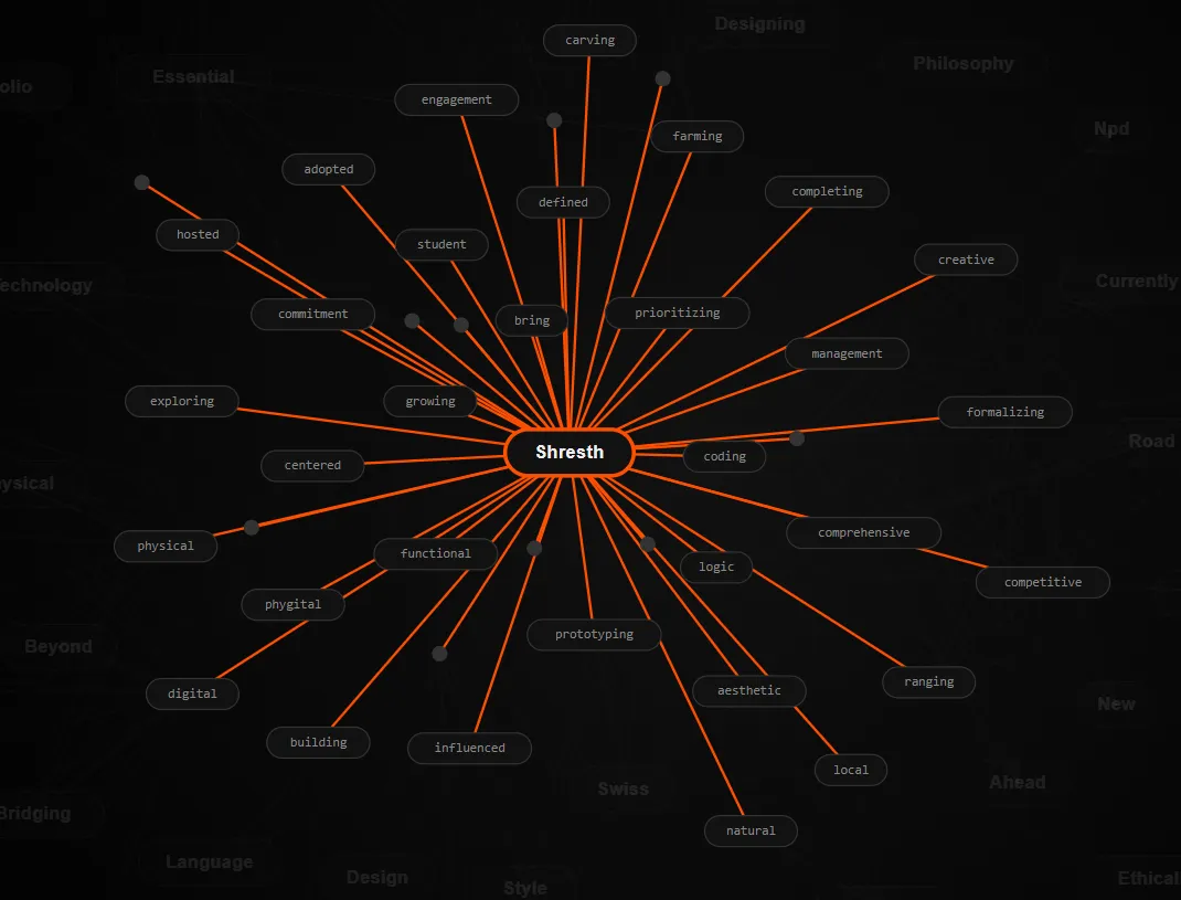
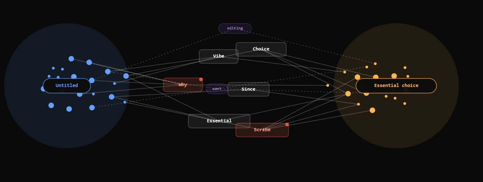
MVP 1 — AI Connection Map Generator
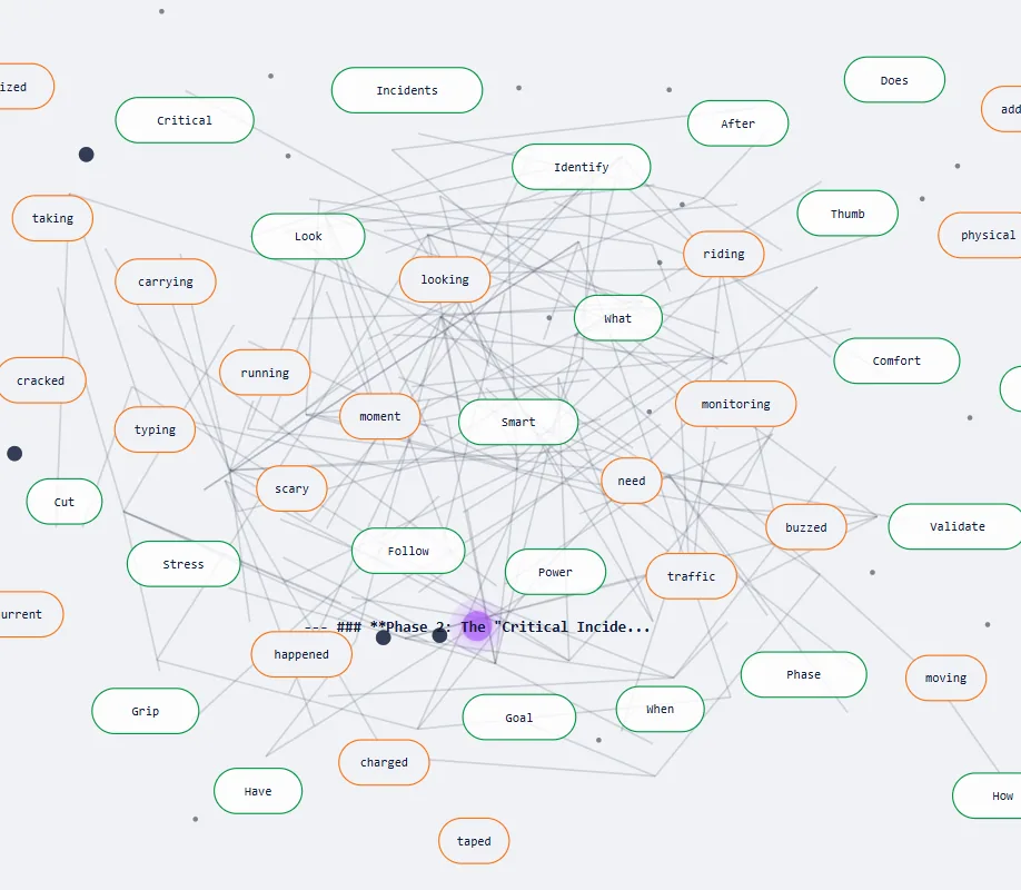
The initial concept allowed users to input raw notes and let an automated AI engine construct a force-directed graph based on word co-occurrences and semantic links.
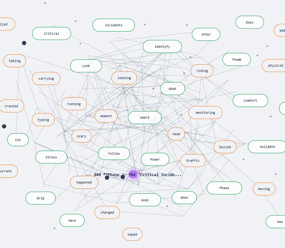
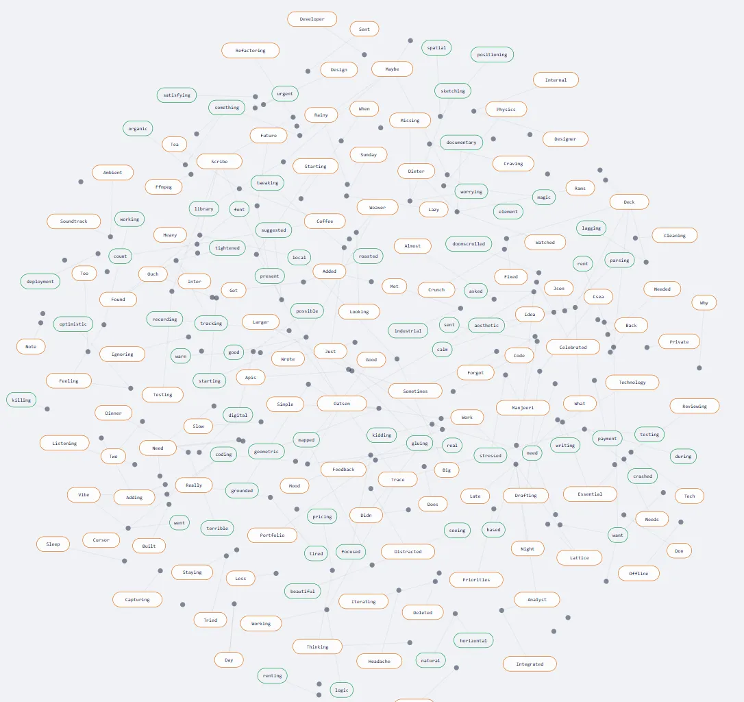
The map looked visually impressive, but failed to serve a practical purpose. The UI provided no direction, turning navigation into an exhausting game of detective.
The tool needed a specific purpose. The UI must drastically reduce cognitive load rather than increase it.
MVP 2 — Storytelling & Qualitative Journey Maps
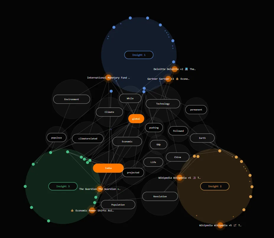
Chose storytelling as the core direction—taking complex qualitative data (like stories, user interview transcripts, and narrative arcs) and representing them as interactive cluster journey maps.
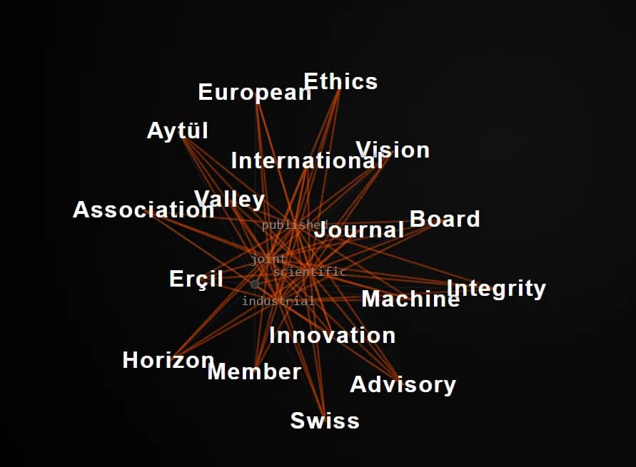
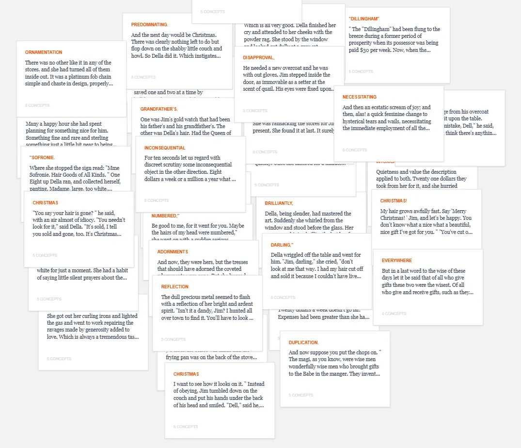
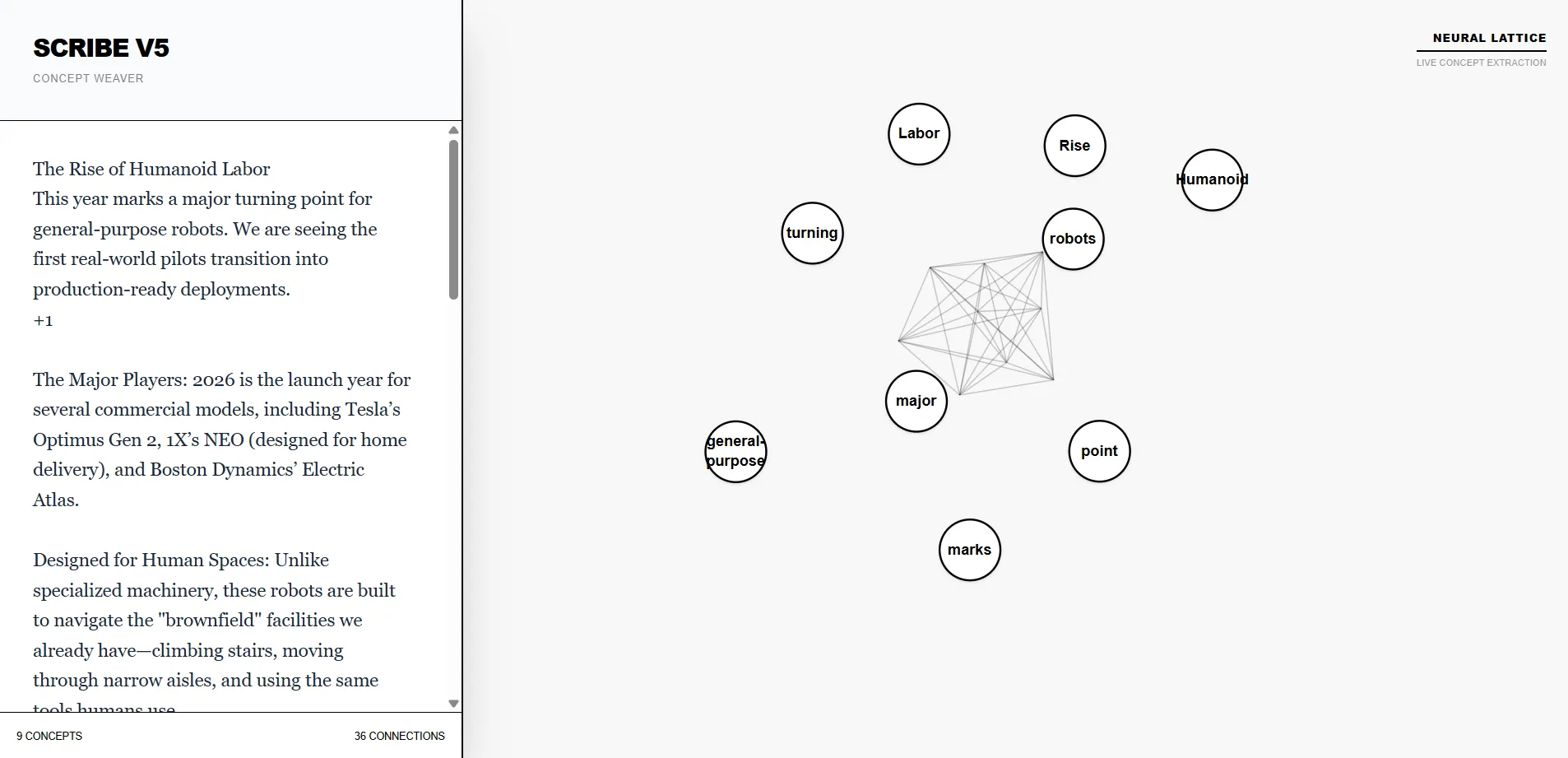
Slightly more useful than MVP 1, but as a tool it still lacked a clear, indispensable purpose. Users felt they were putting in excessive effort decoding visual layouts.
Scrap visual gimmicks entirely. Focus on a specific niche problem for users who need to make high-stakes decisions from dense data.
MVP 3 — Multi-Data Link & Connection Analyzer
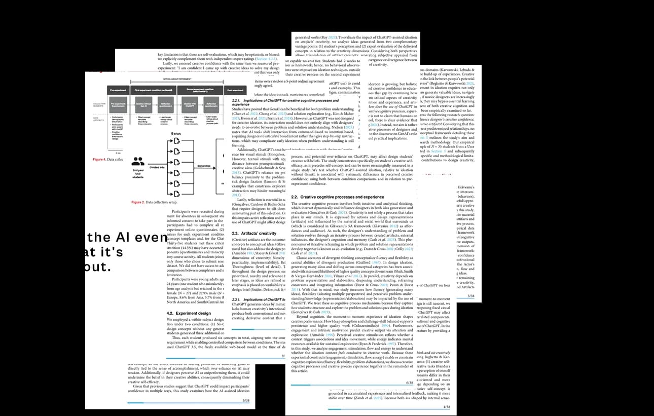
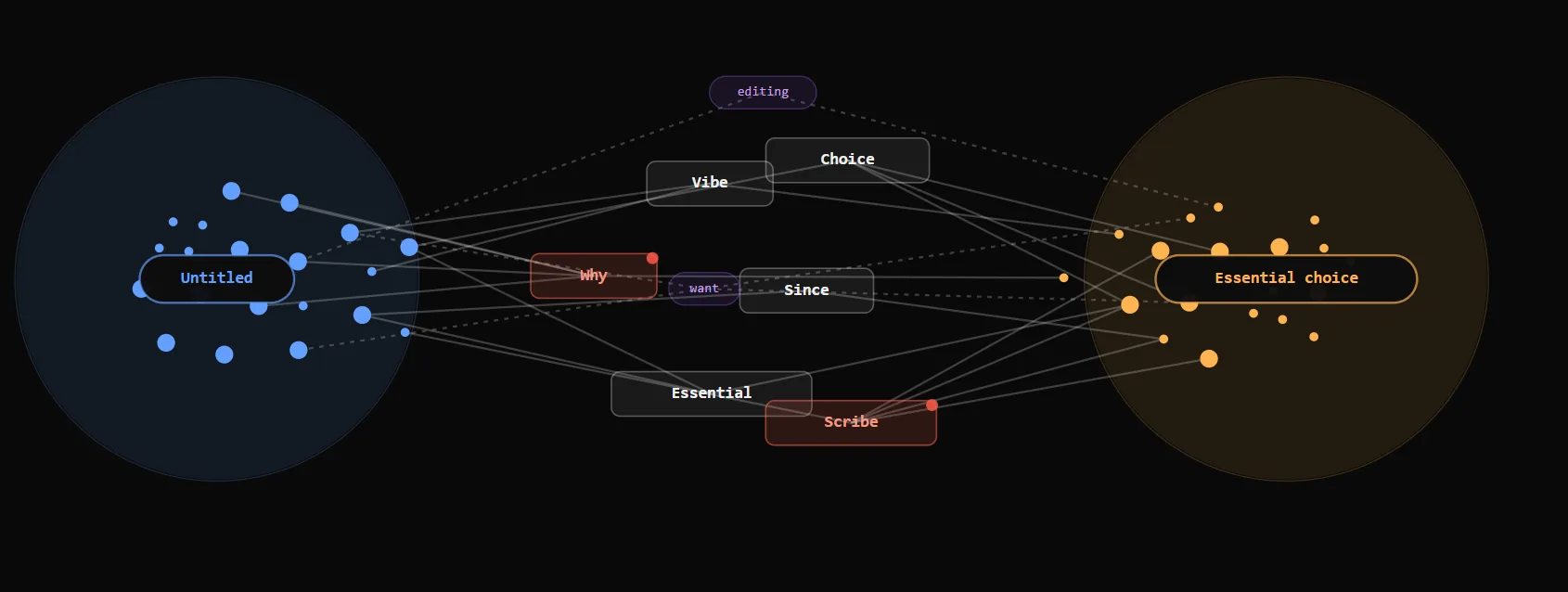
Pivoted away from creative writers toward thinkers, product managers, and researchers—synthesizing complex data inputs, 50-page research papers, and technical requirements into linked analytical graphs.
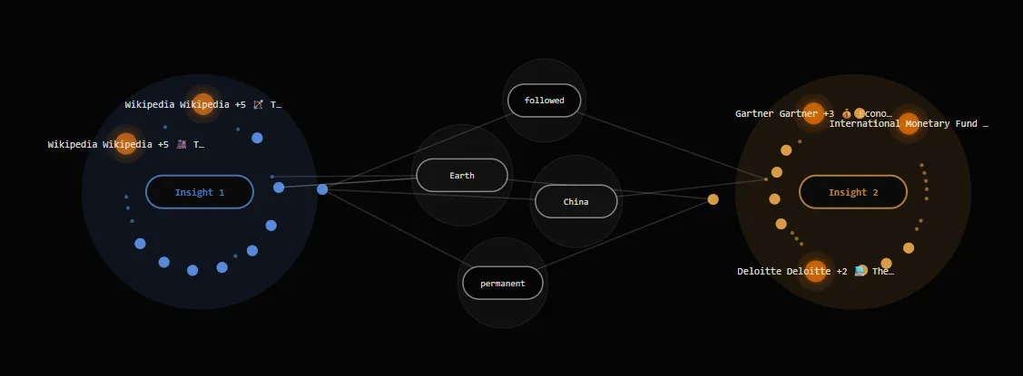
"This looks useful enough but you still need to find a better use case for it. Write a research paper on this..."
"I will use it if it reduces my effort and saves me time. I don't understand the specific context... I'd rather use normal AI."
"I don't want to read all that and either way I don't feel like it helped me."
It was significantly better than previous iterations, but unconstrained graphs still lacked a singular focus to replace traditional AI chat windows in daily workflows.
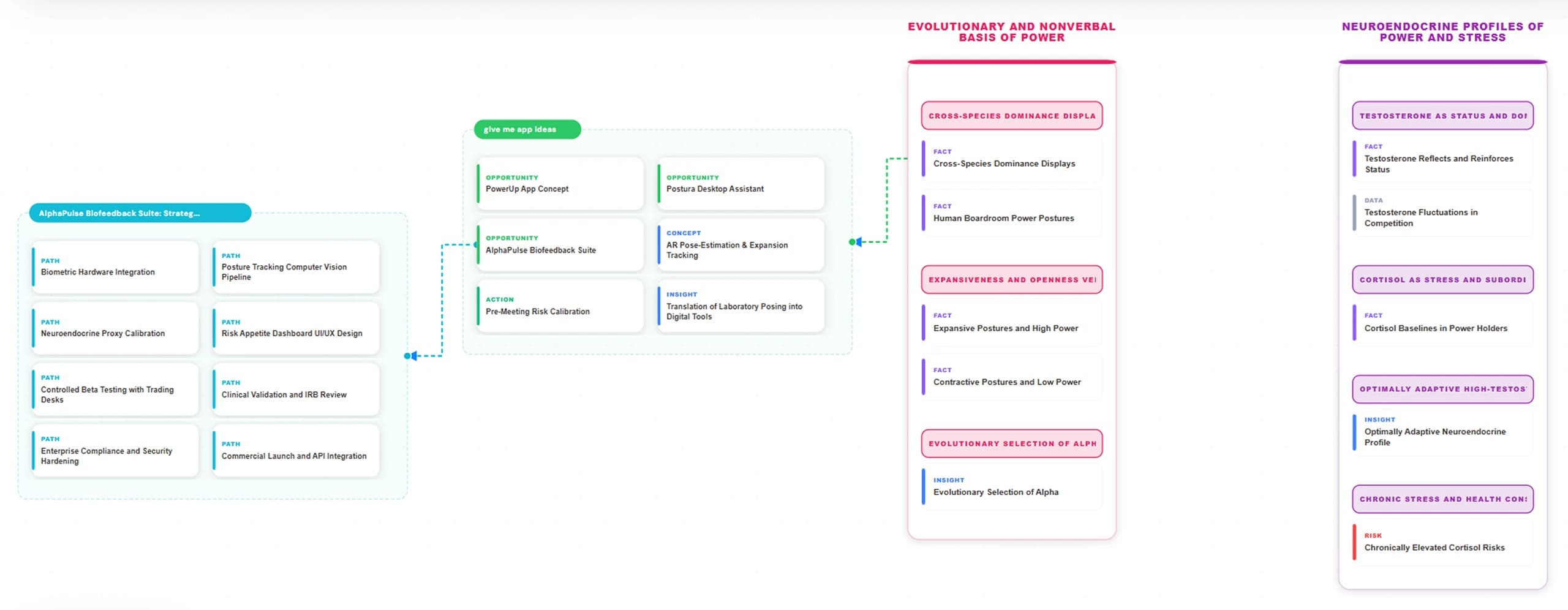
Scrap free-form physics graphs entirely. Constrain D3 to snap nodes into fixed 300px hierarchical columns (Pillars → Clusters → Leaves) tailored specifically for strategic roadmap stress-testing.
Scribe is a local-first, visual note-taking environment designed to solve this specific problem.
It was built as a solo project, meaning I needed a stack that allowed for rapid prototyping without heavy backend infrastructure (Next.js, Tailwind, D3.js, and local IndexedDB).
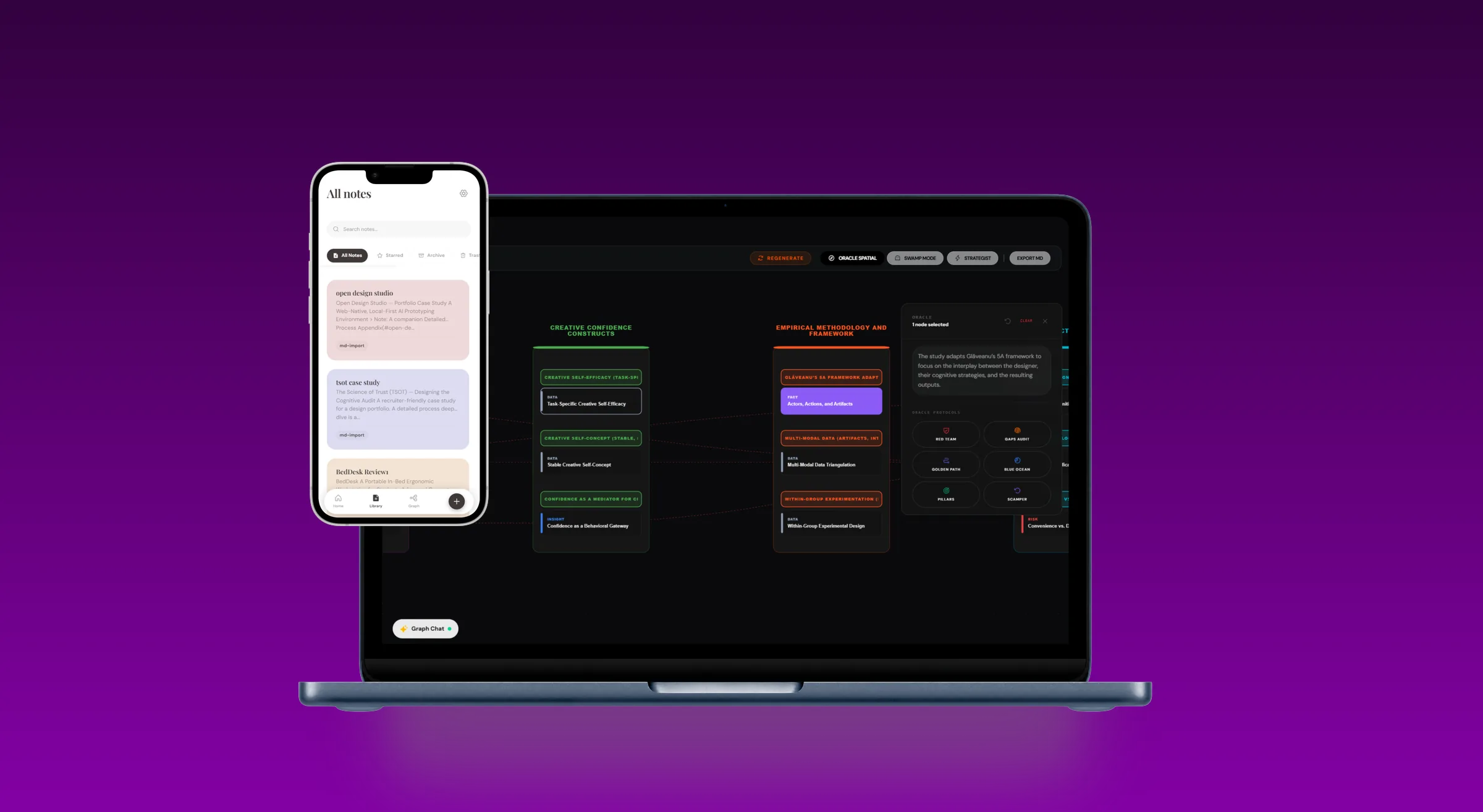
Linear documents hide cross-phase interdependencies.
I was trying to reconcile a product roadmap across 30 different user interviews, technical constraints, and design requirements. I kept losing track of how a feature in Phase 2 would break a constraint we discovered in Phase 1.
Linear documents (like Notion or Google Docs) hide interdependencies. You can link pages, but you cannot see the structural connections. I needed a way to map out complex logic visually without it turning into an unreadable mess.
See Scribe in Action: From raw data to spatial synthesis
A step-by-step walkthrough of how unstructured thoughts are transformed into structured, interactive decision maps.
Friction by design. Users bring their own API keys to guarantee absolute data privacy and zero vendor lock-in.
Ingesting unstructured data, PRDs, and user interviews to prepare for multi-document synthesis.
Selecting multiple sources to generate a unified graph, surfacing hidden cross-document interdependencies.
Automated spatial arrangement snaps nodes into rigid hierarchical columns, removing manual drag-and-drop fatigue.
Conversing with the data logically while maintaining visual context of the entire graph structure.
Packaging insights into portable, linear markdown formats for easy distribution to wider teams.
Forcing hierarchical columns over free-form graphseliminating unnavigable graph hairballs
Most note-taking apps with graphs (like Obsidian) use force-directed layouts. They look cool, but they turn into useless 'hairballs' once you have more than 50 notes.
Decision: I constrained the D3 physics engine to snap nodes into fixed 300px columns based on their hierarchy (Pillars -> Clusters -> Leaves). Trade-off: Users lose the ability to place notes anywhere they want on an infinite canvas, but the structure remains legible and organized even with hundreds of nodes.
Client-side storage over cloud databaseszero-latency storage & complete data privacy across desktop & mobile
Scribe stores all data in the browser using IndexedDB.
Trade-off: It prevents easy multi-device syncing out of the box, but it allowed me to bypass complex authentication flows, ship faster, and guarantee 100% privacy for users working with sensitive strategic data.
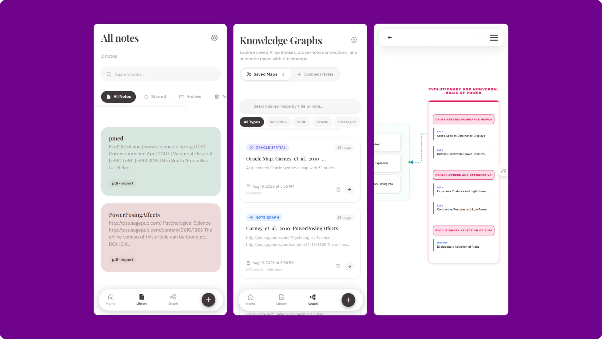
Bring-Your-Own-Key (BYOK) for AI featurestwo-pass semantic extraction with zero vendor lock-in
Instead of charging a subscription for AI credits, users paste in their own OpenAI or Claude keys, or connect to a local Ollama instance.
Trade-off: It adds friction to the onboarding process, but it keeps the app free to host and ensures user data isn't being silently scraped by a middleman server.
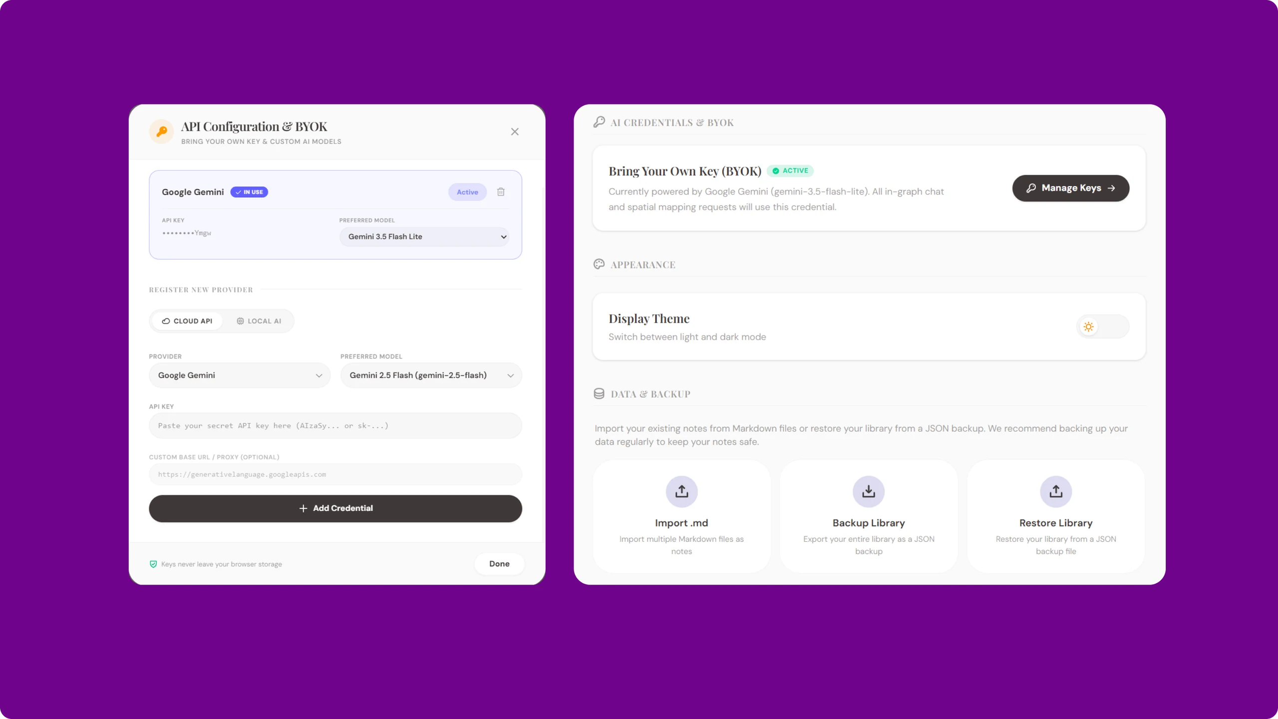
Engineering-Grade System: Tactical Noir & 3-Tier Tokens
Scribe is powered by a fully documented, standalone Design System. To ensure seamless developer handoff, the UI is built on a strict 3-tier token architecture with a 7-State machine testing protocol (Hover, Active, Disabled, Loading, Error, etc.), moving beyond Figma mockups into production-ready schemas.
Color Palette & Contrast Hierarchy
Typography Ladder
Spatial Intelligence for Complex Systems
Micro Workbench & D3 Dynamic Cable Routing
Unhappy paths, logic gaps, and systemic friction revealed spatially. Run adversarial personas across 30 simulated agents.
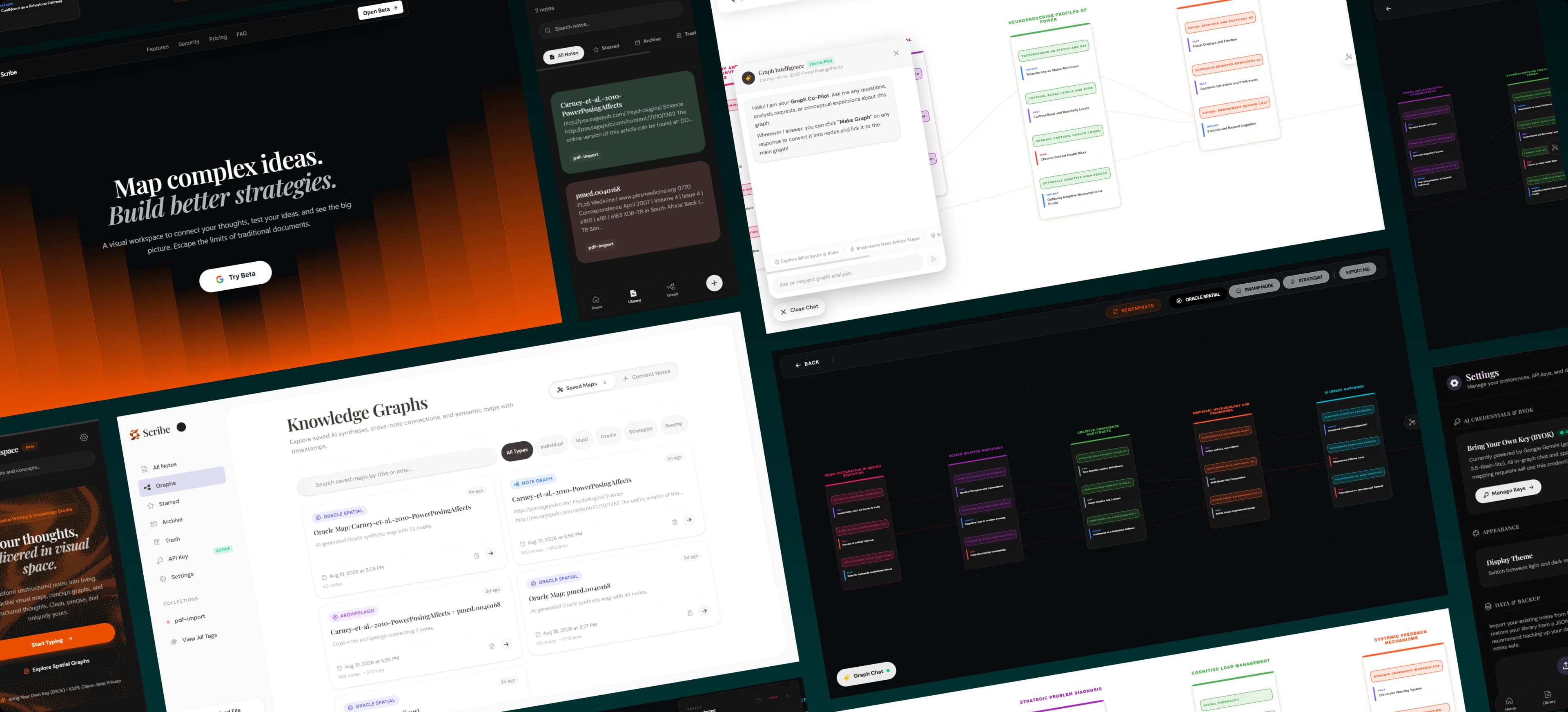
High-Fidelity Interaction: Beyond Standard Patterns
To support the complexity of algorithmic spatial synthesis, Scribe demanded bespoke UI components. From live telemetry HUDs to interactive docks, the interface merges technical density with tactile, low-latency ergonomics.
The primary instrument dock for adding lenses, connecting datasets, and managing workspace snapshots. It uses a horizontal sliding model with dynamic active states.
Adversarial simulation packages for stress-testing product ideas. Each package uses a distinct color identity mapped to specific system behaviors.
The Red Team
Critical analysis, edge-case vulnerability discovery, and systemic friction resistance.
The Bauhaus Council
Utility, essentialism, and industrial ergonomics without decoration waste.
The Market Movers
Business economics, distribution flywheels, and monetization sovereignty.
The Deep Thinkers
Ethics, epistemic humility, and long-term societal resilience models.
Tactical floating HUD overlays, camera controls, coordinate readouts, and spatial resonance indexes mapped over the infinite canvas.
Heuristic recommendation feed with expandable empirical rationale and 2-step verified canvas mutation.
Cluster 4 exhibits high adversarial resistance. Recommend splitting into two decoupled micro-workbenches to isolate failure modes.
Evaluated against Red Team personas. 4/5 models flagged single-point-of-failure in current node wiring.
Production-Ready UI: From Atoms to EU Regulation
A robust design system isn't just about aesthetics; it's about handling unpredictable edge cases and strict legal requirements. Scribe's UI kit was built to gracefully manage missing data, text overflows, and mandatory statutory metadata required for AI products.
7-State Component Machine
Every interactive atom (buttons, nodes, inputs) is mapped across 7 distinct states: Default, Hover, Active, Disabled, Loading, Error, and Success, preventing broken interactions.
Unpredictable LLM Outputs
Strict multiline truncation (line-clamp) and flex-wrap policies ensure that overly verbose AI-generated titles or missing schemas never break the structural grid.
Zero-Data Graceful Fallbacks
When the user has no API key or the local IndexedDB is wiped, the UI gracefully downgrades into an empty state providing clear wayfinding instead of fatal errors.
Every AI-generated output is wrapped in statutory transparency metadata. Scribe implements Articles 13, 14, and 50 of the EU AI Act directly at the component level to ensure TSOT compliance.
Art. 50 — Algorithmic Transparency Badges
Art. 14 — Step-Gate Confirmation
Step 1 of 2: Review the AI's proposed action before confirming execution. You retain full override authority.
Art. 13 — Spatial Epistemic Ledger (Provenance Audit)
Synthesized via deterministic 2-pass pillar-cluster hierarchy. Zero external telemetry custody. Full BYOK client-side execution.
Continuous physics caused distracting canvas jitter. We replaced live simulation with discrete drop snapping.
My first attempt at the "Oracle" view used a standard physics simulation where notes repelled each other. When users tried to drag notes to group them, the physics engine fought back, causing the entire map to constantly jiggle and re-adjust. It was incredibly distracting.
I had to rip out the continuous simulation and write a custom collision-detection script that only calculates physics when a node is actively dropped, snapping it to a strict 40px grid.
Beta Launch: Organic traction & adoption
Scribe was launched as a private beta to validate the core assumption: that users prefer structural friction over generative fluff when dealing with complex system design. The response validated this hypothesis entirely.
Need for Deep Domain Understanding
Designing for strategic thinkers required deep immersion in PRDs, roadmap friction, and non-linear thinking patterns rather than superficial templates.
Learning the Art of Prioritization
As a solo builder, enforcing rigid columns and local IndexedDB eliminated months of backend complexity while delivering instant performance and complete privacy.
Designing to Reduce Cognitive Load
"Ease of Use" shouldn't eliminate constructive friction. Scribe has a learning curve, but that friction acts as a forcing function for clearer architectural thought.
Implementing level-of-detail (LOD) zoom to display macro strategy clusters at wide viewports and reveal leaf cards only as the user zooms into specific clusters.
Transitioning the D3 DOM rendering pipeline to a WebGL/Pixi.js layer to guarantee silky 60fps interaction during large-scale dataset navigation.